How can I add buttons for hyperlinks in my forms?
Add buttons to link URLs, SOPs or internal documents from your forms in Weever
Jump To:
Link relevant resources (documents, videos, websites etc.) to your forms using buttons. Buttons draw attention to the links; they help your associates navigate through the form by making it clear that there's a resource they need to review. And they add a bit of colour to your form!

STEP 1
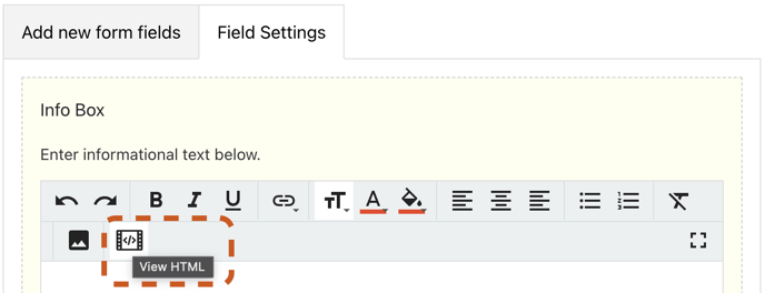
Go to Form Builder and click on the form in which you want to add a button. Add the Info Box field and click on the View HTML icon.

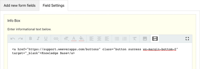
Delete the placeholder text and copy/paste the code below:
<a href="ADD LINK HERE" class="button success wx-margin-bottom-0" target="_blank">ADD TITLE HERE</a>
STEP 2
Replace the ADD LINK HERE text and with a URL (link) to the website or document you want to direct your button to.
Replace the ADD TITLE HERE text with a suitable NAME for your button.
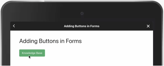
For example, we're creating a "Knowledge Base" button linking to Weever's support page. See below:

And that's it!
You can add as many buttons as you'd like, and you can link them to any URL you want.

Not quite clear? Here's a step by step guide:
PRO TIP - How to change the colour of your button
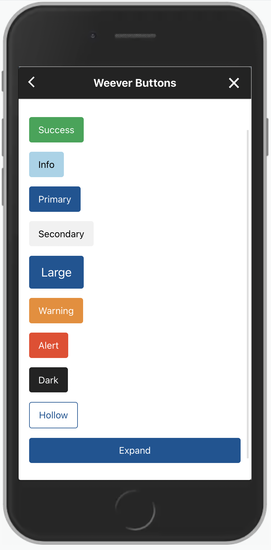
You can change the colour of your button by updating the word "success" in the code.
<a href="ADD LINK HERE" class="button success wx-margin-bottom-0" target="_blank">ADD TITLE HERE</a>

- Take a look at the picture on the left. The word "success" creates a green button, "info" creates a blue button, "primary" creates a navy button', "secondary" creates a grey button, "expand" makes the button fit the width of the screen and so on.
- Let's say we wanted to make our "Knowledge Base" button orange. We would replace the word "success" with the word "warning":
<a href="ADD LINK HERE" class="button warning wx-margin-bottom-0" target="_blank">ADD TITLE HERE</a>
And that's it! The button would now look like this:

NOTE
These colour codes (warning, primary, dark etc.) must be all in lower case in order for this to work.